B2B Marketplace · Mobile App

Increasing conversion rate and digital adoption by personalising the app experience

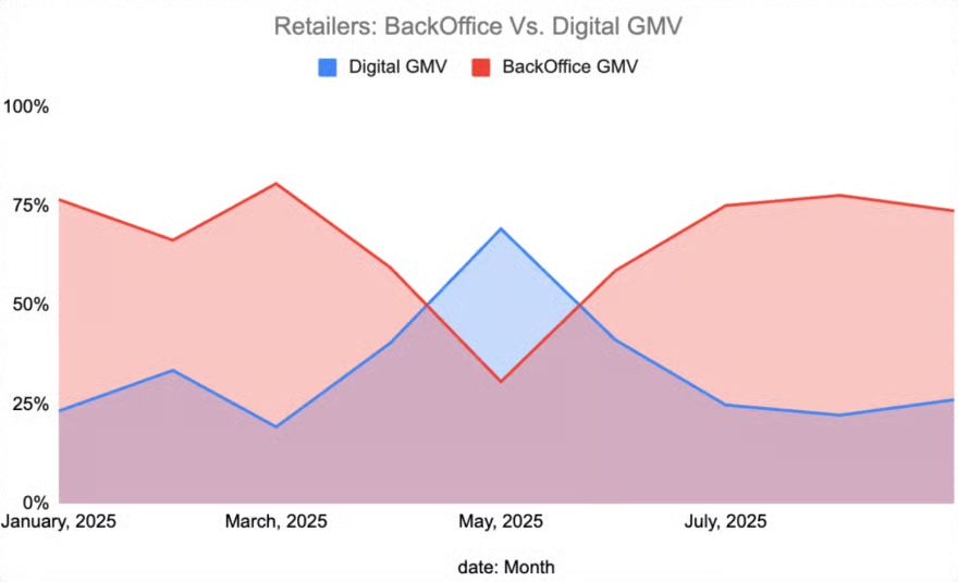
Most business customers on Tradeling ordered through sales agents, not the app. I redesigned the app so each type of business gets its own home page, which moved more orders into the app and reduced the dependency on the offline sales channel.

Role
Sole product designer
Team
1 PM, 3 engineers, 1 data analyst
Year
2025
Focus
Field research, usability testing, data analytics, UX and UI, design system
~38%increase in conversion
+21%increase in session time
~30%increase in GMV from the app

The problem

Most orders still came in offline, through sales agents.

Tradeling sells across 16 categories. Grocery and electronics bring in the most revenue. But the app showed every business everything. A grocer who wanted to buy water and oil saw power tools on the same screen.

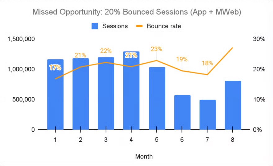
One in five sessions ended in under ten seconds. Most orders still came through sales agents, who placed them for the customer.

Research

Two quarters of analytics barely moved adoption. So I went to the shops.

Google Analytics, UXCam recordings and competitor reviews gave us small fixes, but customers still did not use the app. I pushed for field research: 20+ visits to shops, time with sales agents, and watching owners while they placed orders.

What owners told me

  1. “Only show me what I sell.”

    Every owner said this, big or small. A grocer who has to scroll past power tools does not keep looking. They leave.

  2. “The agent gets me a better price.”

    Buyers thought the fixed price in the app was the worse deal, so they kept ordering through agents.

  3. “Size decides how I buy.”

    Small shops have no storage space, so they order only what they need. Medium businesses buy in bulk and are happy to wait one or two days for a better price.

How do you design one app for a corner grocer, an electronics shop and a salon, when each one only wants to see what it sells?

The idea

One app that changes itself for each business that signs in.

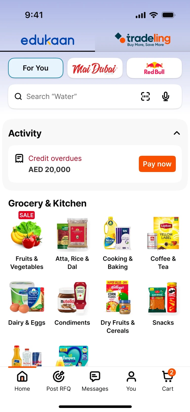
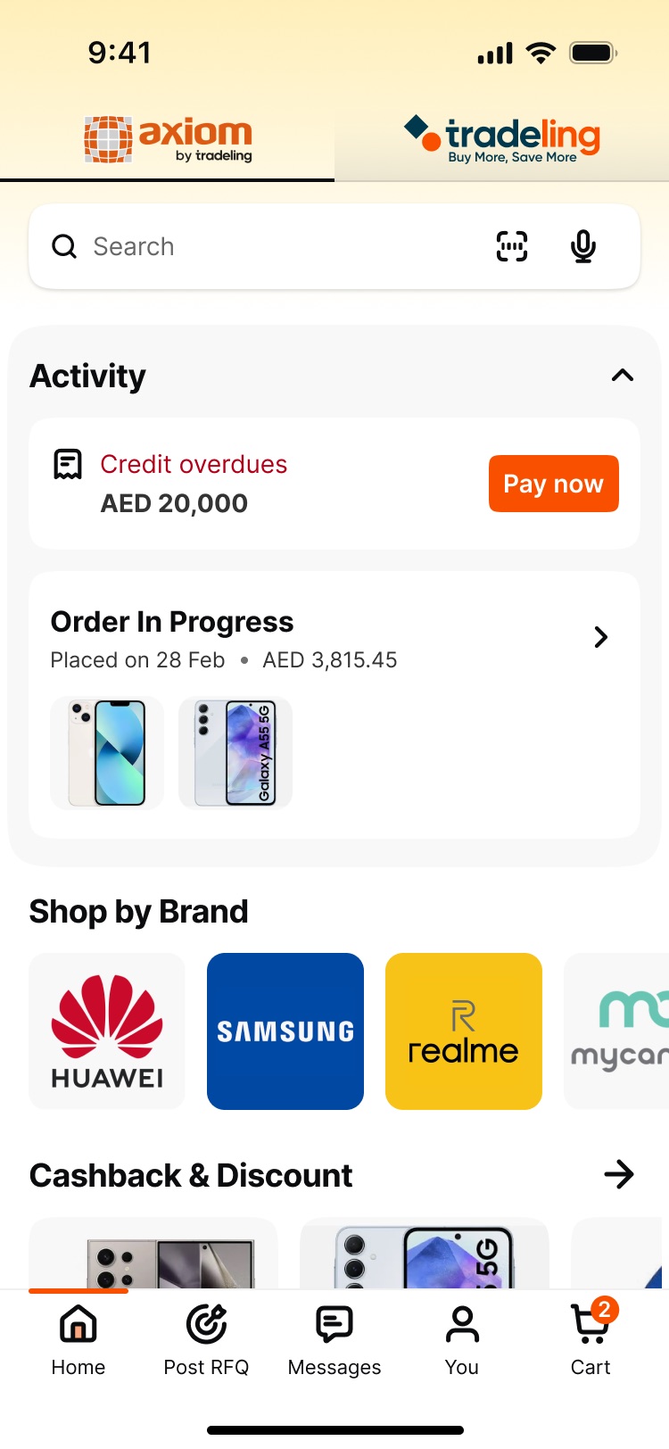
When a customer signs up, their trade licence shows what type of business they are. That decides their vertical. Grocery and IR (Independent Retailers: the electronics and mobile phone shops) have their own home page, categories and brands. Everyone else sees Default, with the full catalogue. It is still one app with one codebase.

Decisions

How we made it work.

01

One home page, with each section tagged by vertical.

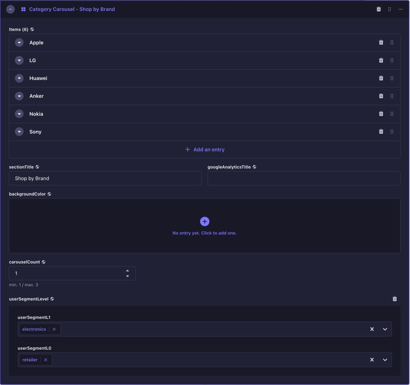
We already had a CMS. With engineering, product and the content team, we looked at a few ways to show different home pages. The one everyone agreed on: tag each section of the page with the verticals that should see it.

The content team keeps one page, and a new vertical needs no new build. We started with Grocery and IR, and the team can add any category next.
02

Shelves built from what each business buys.

Tradeling's catalogue follows its internal structure, not the way a buyer thinks. With the data analyst, I looked at what each type of business actually buys, then built new shelves on top of the catalogue for each vertical, Grocery and IR: renamed some, merged others, and pulled a few in from other categories. Here is the grocery store.

In Tradeling’s catalogueOn a grocery store’s home

Rename

Grains & PulsesFood & Beverages
Rice, Pasta & Pulses

Named the way grocery stores ask for it.

Merge

Oils & FatsPantryBaking IngredientsPantryBaking DecorationsPantrySugarPantryStockPantry
Cooking & Baking

Five shelves a grocery store thinks of as one.

Pull across

BatteriesOffice & StationerySmall Kitchen AppliancesHome & GardenAccessoriesConsumer Electronics
Electronics

Only the electronics a grocery store sells. No large appliances.

Features with impact

Three features that changed how customers use the app.

01

Negotiation, inside the app.

Customers trusted agents because they could ask for a better price. So we put that in the app: ask for a price, get a counter offer, accept.

The price never goes below the floor without approval from the back office. An accepted price is held for a limited time, shorter for fast-selling products.

+60%increase in orders negotiated in the app, instead of through agents
02

Orders and payments due, first thing on the home page.

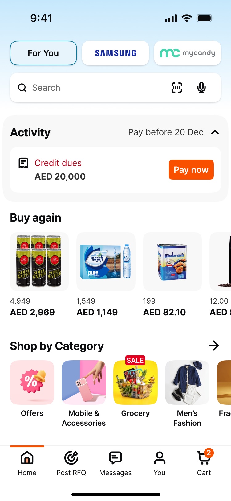
Shop owners are busy and do not browse. Order status and payments due used to be several taps deep. The activity panel shows them at the top of the home page.

Customers started opening the app just to check on their orders, and that became a habit. Sessions got longer, and calls to customer support about orders went down.

15%click-through on the activity panel
03

Brand pills that brands can pay for.

The row of pills at the top of the home page (For You, Samsung, mycandy) gives a brand its own page in the app.

It became a new placement Tradeling can sell to brands.

Newsource of revenue

Design system

A design system rebuilt to scale.

I rebuilt both layers: the foundations, and the components on top.

01 · Foundations

One set of tokens behind every screen.

Components use semantic tokens, like bg/action, that point to raw primitives. Change one value and every screen follows. Modes switch theme (light / dark), language (EN / AR) and font size (mobile / tablet).

02 · Components

Fewer components, more props.

Every content change used to mean a new component. I audited the library and rebuilt it with nested properties, variants and props: from 50+ components to under 10, easier to maintain and ready to scale. Try it below.

Impact

More customers buying in the app, on their own.

~38%increase in conversion
+21%increase in session time
~30%increase in GMV from the app

More work

Fintech · Web Portal

Reimagining quick loans for small businesses in the UAE

QFunder is Tradeling’s new fintech vertical. Banks rarely lend to small businesses, and when they do, it takes weeks. We built an MVP to test a faster way: apply online in minutes, get funded in 24 hours. We built and tested it in two months.

e-Government · Mobile App

Building one home for Abu Dhabi’s government services

TAMM is Abu Dhabi’s initiative to bring government services into one ecosystem. The services were fragmented, so we built one unified digital system where citizens, residents, businesses and visitors complete them in one place.